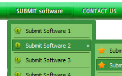
Menu Template:
Cascading Menu Blue Glossy - RoundedButton Web2 0
This menu is generated by Javascript Menu Builder.
Create your own menu now!

Button Web2 0 Screenshots

Menu, Button, and Icon Collection
Javascript Menu Builder provides huge collection of 1400 web buttons, 6600 icons, 300 ready-made samples, so you'll create really nice looking menus and buttons with little or no design skills at all! Web 2.0, Mac, iPhone, Aqua buttons, Vista, XP, transparent, round, glossy, metallic, 3d, tab menus, drop down menus will be a breeze!Button and Icon Samples

How to Use Javascript Menu Builder Menu Generator
- Now let's set the html buttons web-behavior. That is, set their Link properties. To set the button link, select the button by clicking it and then enter the link address in the "Link" field on the Properties toolbox.

Another way to set the button link is to select it and then click the "Select page" button on the Properties toolbox. Open dialog will appear, in which you can select the page you would like to link to. This page's address will then appear in the "Link" field.

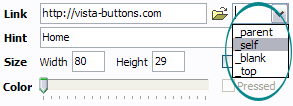
- Also, you can assign link target attributes for each button. This will define where a linked page will be opened in your Web-browser. For example "_blank" attribute will open the linked page in new browser window. Note that link target attribute act exactly like the Target attribute of the <a> tag in HTML. To set button link target attribute, just select the button and then either choose one of the predefined values from the "Link target attributes" list on the Properties toolbox or enter your own value (window/frame name, where the linked page should be opened). Learn more about link target attributes from the user guide.
- Use images for backgrounds of submenus and items, icons, arrows. Using web images you can create menus completely based on graphics. Design both horizontal and vertical menus and submenus with any amount of menus on a single page. Place any HTML code inside the menu item - be it a flash-object, form, picture, or text. This ability lets you to build various menus of any complexity.

Image Navigation
Use images for icons, backgrounds of items. Using images you can create menus entirely based on graphics.
Hover Sounds Code
Easy to Use
With Vista Web Buttons clear and comprehensible interface, you need just 4 simple steps to get your web buttons or html menu ready and if you use a pre-designed sample as a base you'll end up even faster!
Web Rollover Effects
Search Engine Friendly
Vista Buttons generates html code which is transparent to search spiders.
Floating Menu In Html
Integration with popular web authoring software.
Vista Buttons integrates with Dreamweaver, FrontPage, and Expression Web as an extension/add-in. Create, insert, modify a menu without leaving your favorite web design framework!
Submit HTML Graphic Button
Support
Please contact Customer Support at (please include template name in the message title)

FAQ
- ".. are you saying the button creater will be able to generate code that will enable my google editor to link into the images"
- ".. Is there a way to add images to the image collection of the button software? Css Menu Sub
- ".. How SEO friendly is the button maker software? "
- ".. Can site buttons be added to my existing web pages and how easy is it to update once it is installed and do? "
- "I can add as many levels as I want in the button generate program , but just one submenu button per level in the ..."
- ".. I want to clone one of your vista button, make some changes, and save the changed button to a new theme and I'm having trouble figuring out how to do that."


